Polynomial Regression for Coronavirus Cases Predictions
The main task in a Polynomial Regression problem is to find the coefficients which are able to create a mathematical function where the difference between the collected data in orange and the green function is as small as possible. These differences are called residuals and they need to be minimized. The formulas used for the Polynomial Regression are similar to the ones used for the Linear Regression but, while in the case of Linear Regression there is a single feature associated to a certain coefficient, here you have the same feature repeated multiple times but with different exponents such as $x$, $x^2$, $x^3$, and more generally $x^p$. We can notice that the Equation 1 is still linear in the coefficients £\beta£ and this is why the formulas from Linear Regression to estimate these coefficients still apply: here the output $y_i$ is described by the p-th degree polynomial and the $\epsilon$ term takes into account all the factors and noise not included in the inputs. \begin{equation} y_i=\beta_0+\beta_{1}x_{i}+\beta_{2}x_{i}^2+\cdots+\beta_{p}x_{i}^p+\epsilon_i \end{equation} Click the button below for an introduction on Polynomial Regression and its formulas.
The problem the we want to solve is the prediction of the coronavirus cases on a given day and we select USA as the country for this example. The datasets are pretty recent given that the pandemic is a new issue that the world is facing. These are the two sources for the 2 datasets that I am going to use: European Centre for Disease Prevention and Control Data and WHO Data. This is the location of the data and their format at time of this ananalysis, obsiouvly the type of data and their location might change in future.
The input for this regression is really simple, it just uses the number of days starting from 0 while the output is the number of cumulative cases. We constantly hear that the virus grows exponentially which can be true in the short terms but in reality an exponential growth is not sustainable in the long term, because people die or they are too sick to go around and infect other people, or they have been already infected and are less likely to get infected again or the cases also artifically decrease due to government measures to reduce contact between people. In general, an exponential growth begins to decrease its rate when the resouces that feed the growth, in this case people that did not get infected, become more scarce and this is typically true in any context given that the resources in reality are always limited. So, what really happens is that the growth can be represented with a higher degree polynomial and in this case we select a 3-degree polynomial because has provided good results.
Now let's show how this is done in practice. I am going to use Python and a free machine learning library called Scikit-Learn. The first library is pandas, which is used to handle data and load files. The second is numpy which is especially useful in data with many dimensions and it also has many mathematical functions. Line 3 shows how we import the Linear Regression function that we are going to use today given that the coefficients are still linear. Line 4 imports a function that generates the polynomials. Line 5 imports functions that we will be using to split the data into training and testing. Line 6 imports the metrics that will be used to evaluate the performance of the model. Line 7 imports the matplotlib library to plot the data and the results.
import pandas as pd
import numpy as np
from sklearn.linear_model import LinearRegression
from sklearn.preprocessing import PolynomialFeatures
from sklearn.model_selection import train_test_split
from sklearn import metrics
import matplotlib.pyplot as plt
We can start with the code:
- Line 1 assigns to a variable the location of the dataset. Here you need to include your specific path. The first dataset that we are going to use comes from the European Centre for Disease Prevention and Control and it has data from the beginning of the pandemic up to 14th December 2020.
- Line 2 uses the function read_csv from pandas to load the dataset into variable df.
- Line 3 filters the data by taking only the rows where countryterritoryCode is equal to USA and then it returns a numpy representation of the dataframe by only considering the values in the columns called "cases". Also the data are flipped because the values in the file start from the end an the first row is the latest available day.
- Line 4 takes this cases and uses a numpy function to create cumulative cases. Essentially every value in the new vector is a sum of the current value and all the previous values.
path='data.csv'
df = pd.read_csv (path)
cases=np.flip(np.array(df.loc[df['countryterritoryCode'] == 'USA']["cases"]))
cumulative_cases=np.cumsum(cases)
We can now split the data and train the polynomial model to find the optimal linear coefficients.
- Line 1 creates a sequence of numbers which begins with 0 and ends with the total amount of data points -1. So, if for example, there are 10 data points the sequence goes from 0 to 9.
- Line 2 creates a third degree polynomial.
-
Line 3 creates the transpose of the array with the range of days which now becomes a vertical array instead of being horizontal. This can be seen below wih a vector from 0 to 4 using the console.
np.transpose([range(5)]) Out[4]: array([[0], [1], [2], [3], [4]]) -
This is done because, in line 4, the polynomial transformation will assign to each row a polynomial of third degree. So, as you can see below using the same range from 0 to 4. The first column is formed by number raised to the power of 0 and this is why is composed by only ones, the second column are the original numbers or raised to the power of 1, the third columns are the square numbers and the fourth column are the cube numbers.
cases_poly.fit_transform(np.transpose([range(5)])) Out[7]: array([[ 1., 0., 0., 0.], [ 1., 1., 1., 1.], [ 1., 2., 4., 8.], [ 1., 3., 9., 27.], [ 1., 4., 16., 64.]]) - So now our data, which we call $x$ in line 4, become a matrix which also includes the intercept which is the first column. While our target values, called $y$ in line 5, are the cumulative cases.
- Lines 7 and 8 split the data into training and testing by using 30% of the data for testing and the rest for training. Note that we are not taking a random sample of data but we set "shuffle" to False, this means that the first 70% of the data are for training and the remaining 30% are used for testing. This is important because we want to use past days to predict future days.
- Then, Line 9 does the actual fitting of the model using the training data and we set "fit_intercept" to False because the data already have an intercept included which is the column of ones.
x_plot=range(cumulative_cases.shape[0])
cases_poly= PolynomialFeatures(3)
x_poly=np.transpose([x_plot])
x=cases_poly.fit_transform(x_poly)
y=cumulative_cases

x_train, x_test, y_train, y_test = train_test_split(
    x, y, test_size=0.3,shuffle=False)
reg = LinearRegression(fit_intercept=False).fit(x_train, y_train)
The next step is to evaluate the performance of the trained model against the training and testing data and also see some plots of the actual and predicted values. We are going to create a function called linear_predictions to do that. It is called linear predictions just because, although we are doing a Polynomial Regression, we are still using the formula from Linear Regression to get the coefficients.
- Line 1 shows that the input of the functions are the trained model reg, the independent data x and the target y
- Line 2 prints on the console the R2 which is a common metric used to evaluate linear models and the values of this metric are typically between 0 and 1 although it can become negative if the model performs poorly. It can be used also for Polynomial Regression because the coefficients are still linear.
- Line 3 uses the metrics library to calculate the Root Mean Squared Error which is another common way of evaluating models in regression problems. I have done a video which provides more details about these two metrics and how they are calculated, you can find it in the description below.
- Line 4 uses numpy library to round the value to only 2 decimals and then it is printed on the console with Line 5
- Lines 6 to 13 create the plot by using matplotlib with both the actual values and the predicted values. In particular, the actual values are plotted using line 7 and the predicted values are plotted using line 8 using the trained model and the function predict.
- Then, Line 16 uses this newly created function with the training data while Line 18 uses this function with the testing data.
def linear_predictions(reg,x,y):
    print("R2: "+str(reg.score(x, y)))
    rmse=metrics.mean_squared_error(y,reg.predict(x),squared=False)
    rmse=np.round(rmse,2)
    print("RMSE: "+str(rmse))
    plt.figure(figsize=(10, 8))
    plt.plot(x.transpose()[1],y,label="Actual Values")
    plt.plot(x.transpose()[1],reg.predict(x),label="Predicted Values")
    plt.legend(fontsize=18)
    plt.tick_params(labelsize=18)
    plt.xlabel("Days",fontsize=18)
    plt.ylabel("Cases",fontsize=18)
    plt.show()

print("Training Data")
linear_predictions(reg,x_train,y_train)
print("Testing Data")
linear_predictions(reg,x_test,y_test)
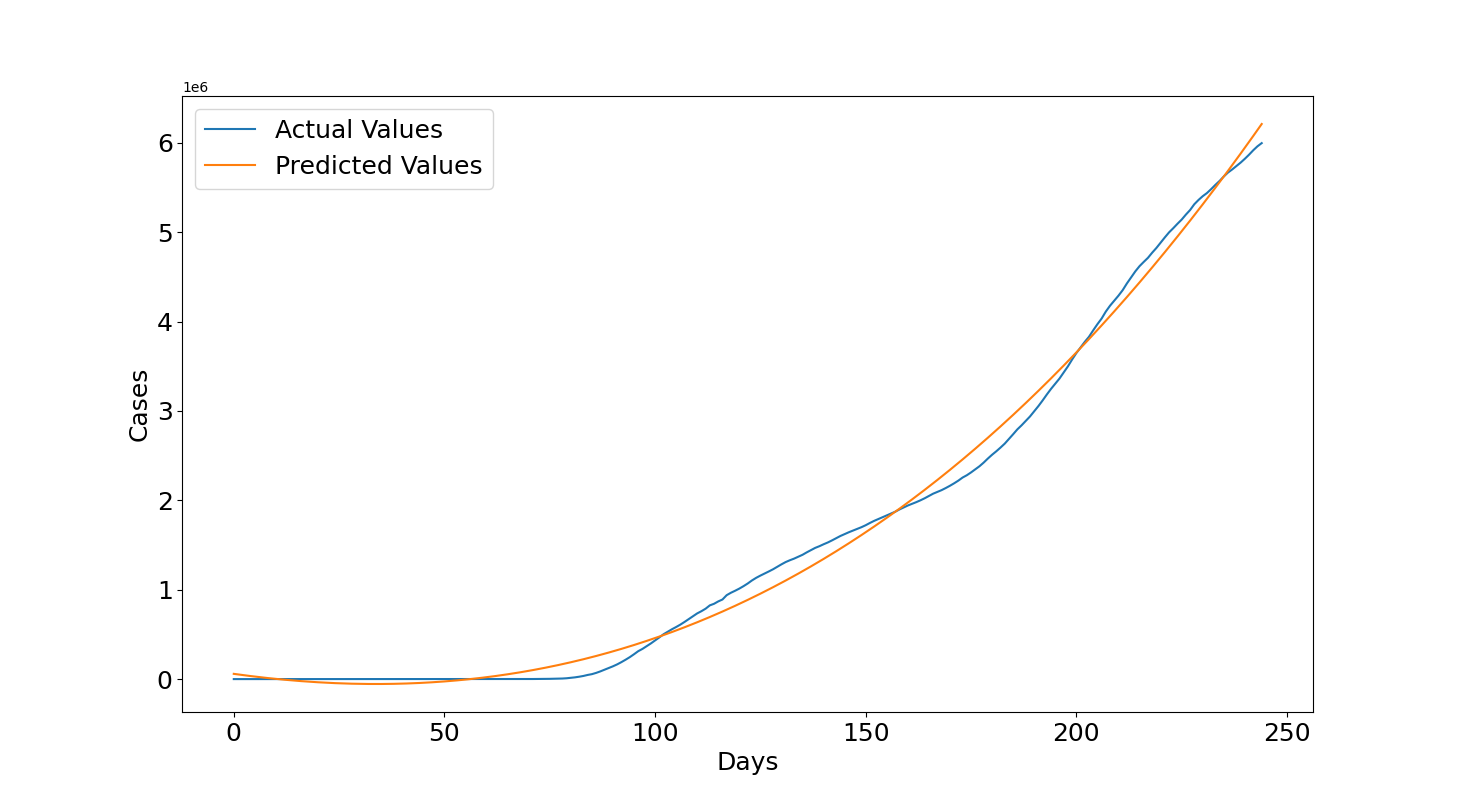
We can see the results obtained with the training data. Figure 1 shows that the curve of the predicted values in orange is quite close to the curve of the actual values in blue and this is confirmed by the quantitative results, the $R2=0.995$ is really close to 1 and Root Mean Squared Error ($RMSE=124627.16$) shows an error in the order of 100k but the number of cases are raised to the power of 6 as we can see in the top left of the plot, so they are in the order of millions for this reason the error is acceptable.
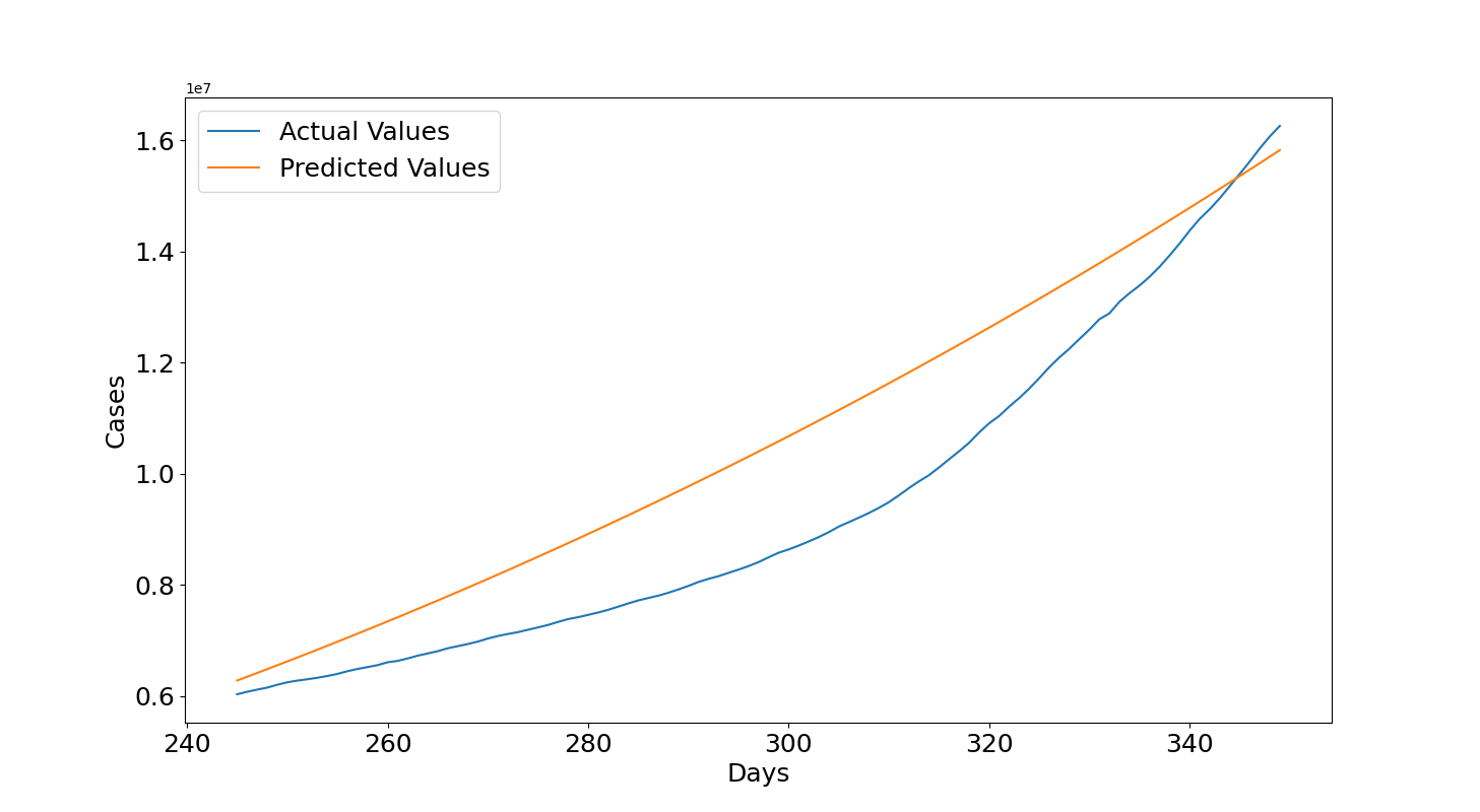
Let's see now the results with the testing data. Figure 2 shows that for most of the graph the predictions overestimate the actual values but then the actual values start to increase and get again close to the third degree polynomial curve fitted with the training data. Overall, the results provide a good estimate. The $R2=0.767$ is close to 0.8 which is considered a good value, now the $RMSE=1393252.73$ is around 1.4 millions but it is worth noticing that now the cases are raised to the power of 7 so they are in the order of tens of millions so it can overall be considered fine to provide an indication with this method of the expected future cases if the growth roughly continues with the same rate.
The Section below shows how this method is then used to predict the future and analyzes the results.
Future Predictions with Polynomial Regression
Let's use all the available data mentioned before to predict 90 days into the future in order to understand what to expect. First, from lines 1 to 4 we can print all the last values in the training and testing data from the actual values and from the predictions of the trained model. In this way we can visually compare them. Then, in line 6 we train the full dataset and in line 7 we use the linear_predictions function defined in the previous Section. In line 9, we select a day 90 days into the future from the last available day which was 14th December 2020 and 90 days after that we have the 14th March 2021. Line 10 creates the polynomials for this day and line 11 will provide the prediction which we can compare with the actual values (hard-coded in the script) for the 14th of March provided in line 8.
print("Cases last training day: ", y_train[-1])
print("Cases predicted training day: ", np.round(reg.predict([x_train[-1]])[0]))
print("Cases last testing day: ", y_test[-1])
print("Cases predicted testing day: ", np.round(reg.predict([x_test[-1]])[0]))

reg = LinearRegression(fit_intercept=False).fit(x, y)
linear_predictions(reg,x,y)
print("Cases 14th March 2021: 30132362")
day=x_poly[-1]+90
x_day=cases_poly.fit_transform([day])
print("Cases predicted training day: ",np.round(reg.predict(x_day)[0]))
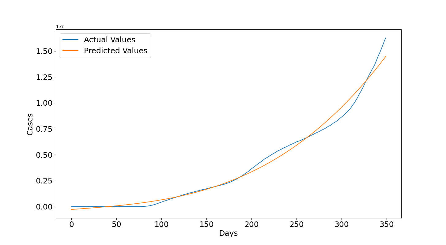
Let's see the results. Figure 3 shows that the model is able to fit the full data and this is confirmed by an high $R2=0.988$ and with $RMSE=454004.59$ close to half million while the curve reaches values of tens of millions. In the console below we can all the results such as the latest actual values and predictions obtained in the previous training set and testing set. The last training day is close to 6 millions for both the cases and the last testing day is close to 16 millions again for both the cases. Then, the predicted number of cases for the 14th March 2021 was 27.5 millions which is an underestimate of the real value of 30 millions but it is overall not a bad guess. The model was able to provide a correct indication of the expected number of cumulative cases.
Cases last training day:
5997163
Cases predicted training day:
6211020.0
Cases last testing day:
16256754
Cases predicted testing day:
15820386.0
R2: 0.988
RMSE: 454004.59
Cases 14th March 2021:
30132362
Cases predicted training day:
27441702.0
We can go a bit more into the details to see what's happened in 2021 and why the value was underestimated. To do that, we need to use the values from WHO which contain also data after the 14th december 2021. The code is overall similar to what has been done with the previous case but there are a few differences that I would like to highlight. In line 3 we filter by Country which in this case is United States of America and then we directly get the cumulative cases given that the WHO data already have these numbers and also we do not need to flip the data because in this dataset the new values are added at the end and not at the beginning. In line 13 we use a test_size of 0.356: this was selected to make sure that the training data ends exactly on 14th December 2020 to replicate the previous trained model and then use the testing set to see what's happened. The rest is the same and you can pause the video if you want to read every line.
path='WHO-COVID-19-global-data.csv'
df = pd.read_csv (path)
cumulative_cases=np.array(df.loc[df['Country'] == 'United States of America']
                          ["Cumulative_cases"])

x_plot=range(cumulative_cases.shape[0])
cases_poly= PolynomialFeatures(3)
x_poly=np.transpose([x_plot])
x=cases_poly.fit_transform(x_poly)
y=cumulative_cases

x_train, x_test, y_train, y_test = train_test_split(
    x, y, test_size=0.356,shuffle=False)
reg = LinearRegression(fit_intercept=False).fit(x_train, y_train)

print("Training Data")
linear_predictions(reg,x_train,y_train)
print("Testing Data")
linear_predictions(reg,x_test,y_test)
The results that we obtain for the training data are similar to those obtained with the other dataset and this is expected given that the data are mostly the same although there are a few differences in some numbers and also the WHO data begin a few days after the previous dataset. However, these differences are negligible given that we obtain a similar R2 and RMSE (i.e. Previous R2: 0.988, Previous RMSE: 454004.59, R2: 0.988, RMSE: 450699.77).
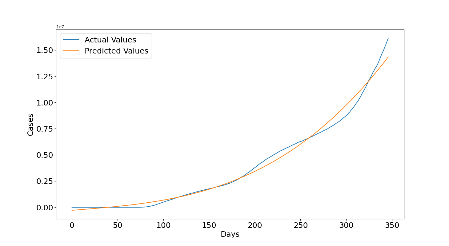
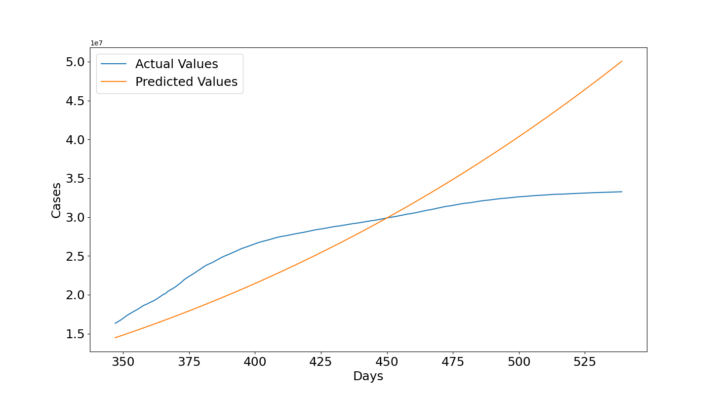
Now we can see what's happened in 2021. In this case, the values are underestimated in the first 100 days after 14th December 2020 but then they become largely overestimated. We can see that at the end of the plot, which is the 25th June 2021, the predicted values are 50 millions but the actual values are between 30 and 35 millions. This seems related to the several lockdowns and vaccination programs that helped to lower the number of infections. The reason for this wrong forecast is related to the fact that the growth rate decreased and it is much lower than before, remember that the model assumes that overall the cases should increase with the same growth rate. If that is not the case anymore then the assumption is false and obviously the polynomial needs to be trained again with more recent data. This is reflected also in the quantitative metrics which shows a negative $R2=-0.992$ and a $RMSE=6614709.37$ of almost 7 millions.
So, to do a more accurate forecast also other factors need to be considered given that they will help to describe better circumstances related to the increase or decrease of cases. By using only the number of days then we are assuming a specific function which is not influenced by anything else. Also, if the data points form a complex function it is difficult for the model to well describe the data. A possible solution is to increase the polynomial's degree but this might lead to have an unstable model which is more prone to underestimate and overestimate unseen data so this needs to be done cautiously. However, this type of model is good to have an indication on what will happen in the future if the cases keep growing according to the same function determined with the training data but it cannot be considered reliable given that in reality there are several waves, seasons, lockdowns, vaccination programs and so on which seem to affect the virus: cases can decrease or increase more rapidly with variations of these factors and they, together with many others, need to be considered if more precise results are required.
Comment on Reddit
Related Topics
Latest AI and ML Pages
- [1] Python code of common Regression Metrics from scratch and also by using sklearn
- [2] Interactive Polynomial Regression Code modifiable by the user in Javascript
- [3] Polynomial Regression is used to predict Coronavirus cases with scikit-learn
- [4] An example problem which uses Polynomial Regression: The Rescue Mission
- [5] Code of Polynomial Regression created from scratch in Python using only main equations
Top AI and ML Pages
- [1] Introduction to Artificial Intelligence and Machine Learning
- [2] Details and formulas of some common Regression Metrics: MAE, RMSE, MSE, R2
- [3] Introduction to Linear Regression, main equations and concepts
- [4] Introduction to Polynomial Regression, main equations and concepts
- [5] Linear Regression is used to predict the house prices with scikit-learn