Linear Regression predicts House Prices
The problem that we need to solve is about predicting the values of the houses in Boston. This is a small dataset from 1978 with 506 records and 13 variables that define the houses. The dataset can be ound Here under the "Boston housing" section. Below you can find the description of all the 13 variables which take into account different aspects such as crime rate, pollution, number of rooms and education:
- 1. CRIM per capita crime rate by town
- 2. ZN proportion of residential land zoned for lots over 25,000 sq.ft.
- 3. INDUS proportion of non-retail business acres per town
- 4. CHAS Charles River dummy variable (= 1 if tract bounds river; 0 otherwise)
- 5. NOX nitric oxides concentration (parts per 10 million)
- 6. RM average number of rooms per dwelling
- 7. AGE proportion of owner-occupied units built prior to 1940
- 8. DIS weighted distances to five Boston employment centres
- 9. RAD index of accessibility to radial highways
- 10. TAX full-value property-tax rate per $10,000
- 11. PTRATIO pupil-teacher ratio by town
- 12. B 1000(Bk - 0.63)^2 where Bk is the proportion of blacks by town
- 13. LSTAT % lower status of the population
Now that we have defined the problem and the methodology we can show how this is done in practice. I am going to use Python and a free machine learning library called Scikit-Learn. I will show the full code. If you are interested in creating Linear Regression from scratch you can click the button below.
The first library is pandas, which is used to handle data and load files. The second is numpy which is especially useful in data with many dimensions and it also has many mathematical functions. Line 3 shows how we import the Linear Regression model that we are going to use today. Line 4 imports functions that we will be using to split the data into training and testing and also functions that perform cross-validation. Line 5 imports a feature selection function which we will use at the end to try to reduce the number of variables. Line 6 imports the metrics that will be used to evaluate the performance of the model. Line 7 imports the matplotlib library to plot the data and the results while line 8 imports seaborn which is another data visualization library which, I believe, improves the aesthetics of the plots and will be also used for some specific plots.
import pandas as pd
import numpy as np
from sklearn.linear_model import LinearRegression
from sklearn.model_selection import cross_val_score,train_test_split
from sklearn.feature_selection import RFE
from sklearn import metrics
import matplotlib.pyplot as plt
import seaborn as sns
Let's start with the code: Line 1 assigns to a variable the location of the dataset. Here you need to include your specific path, line 2 uses the function read_csv from panda to load the dataset into df, line 3 returns a numpy representation of the dataframe by only considering the values. The data are in a matrix 506 by 14 where the first 13 columns are the features and the last column are the prices so line 4 assigns all the inputs to x and Line 5 assigns the outputs to y. Line 6 sets the seaborn theme: I noticed that by including this before including any plot it will use the default seaborn theme also with matplotlib plots.
path='housing.data'
df = pd.read_csv (path,header=None)
d=df.values
x=d[:,0:13]
y=d[:,13]
sns.set()
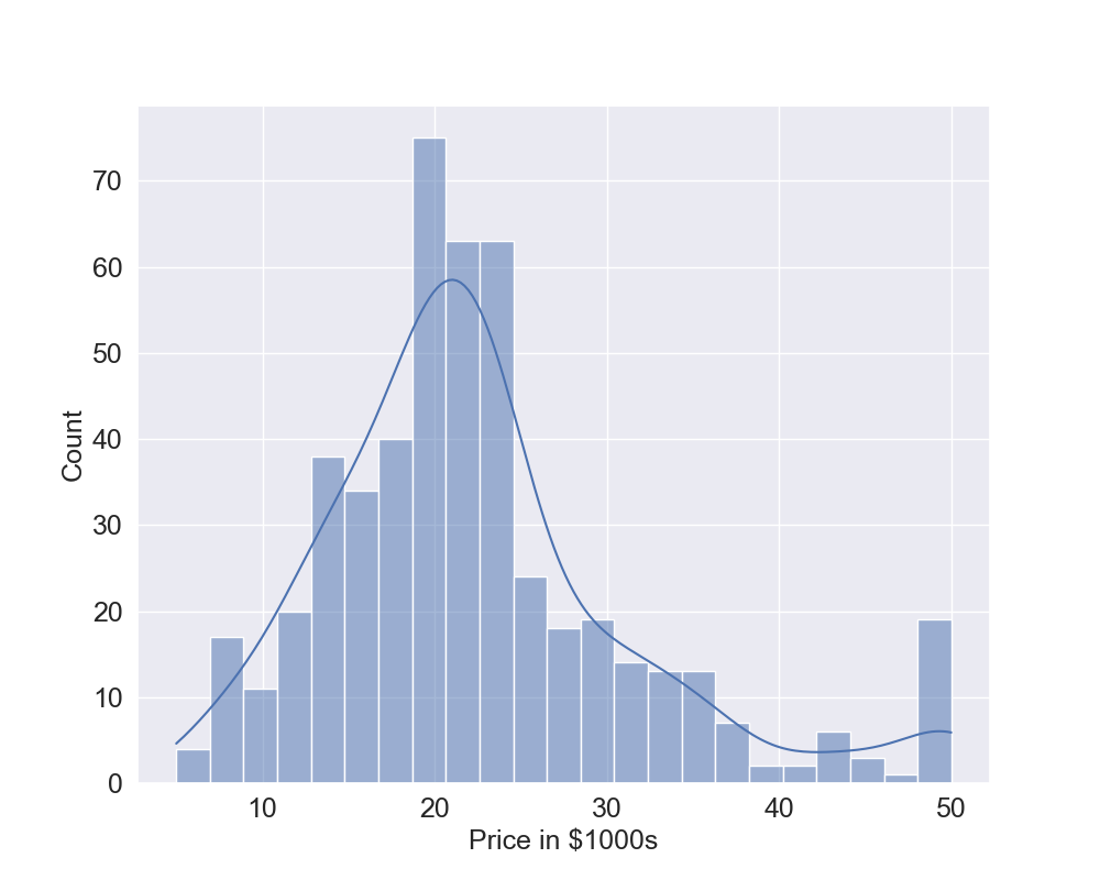
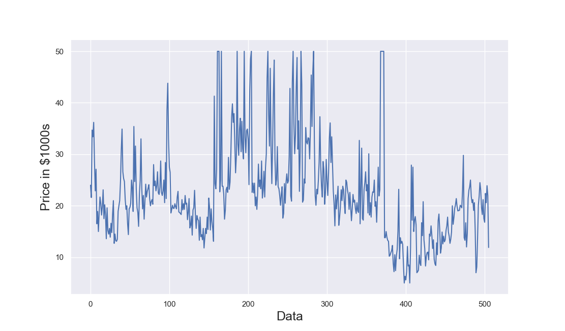
Let's plot the frequency distribution of the output but, to do that, we first create in Line 1 a function called plot_histogram which has 2 inputs: the output y and the text to show as label. Line 2 creates a figure of dimensions 10 by 8, Line 3 uses the seaborn library to create an histogram of the variable y and also produces the kernel density estimation which is a smoothed function of the data, Lines 4 to 6 set the labels and the sizes of the font. Now that we have created the function, we can call it in Line 8 and this generates the plot in Figure 1 (click to enlarge). The data are a bit skewed but we will discuss later about this. In Lines 9 and 10 we use the function train_test_split which splits the data into training and testing sets. In this example, we use 80% training and 20% testing. Note that the random_state set to a fixed value makes the results reproduceable. Line 11 is the actual fitting of the data: we fit the Linear Regression model using the training data which is the 80% of the total data.
def plot_histogram(y,text):
    plt.figure(figsize=(10, 8))
    sns.histplot(y,kde="True")
    plt.tick_params(labelsize=18)
    plt.xlabel(text,fontsize=18)
    plt.ylabel("Count",fontsize=18)

plot_histogram(y,"Price in $1000s")
x_train, x_test, y_train, y_test = train_test_split(
    x, y, test_size=0.2, random_state=0)
reg = LinearRegression().fit(x_train, y_train)
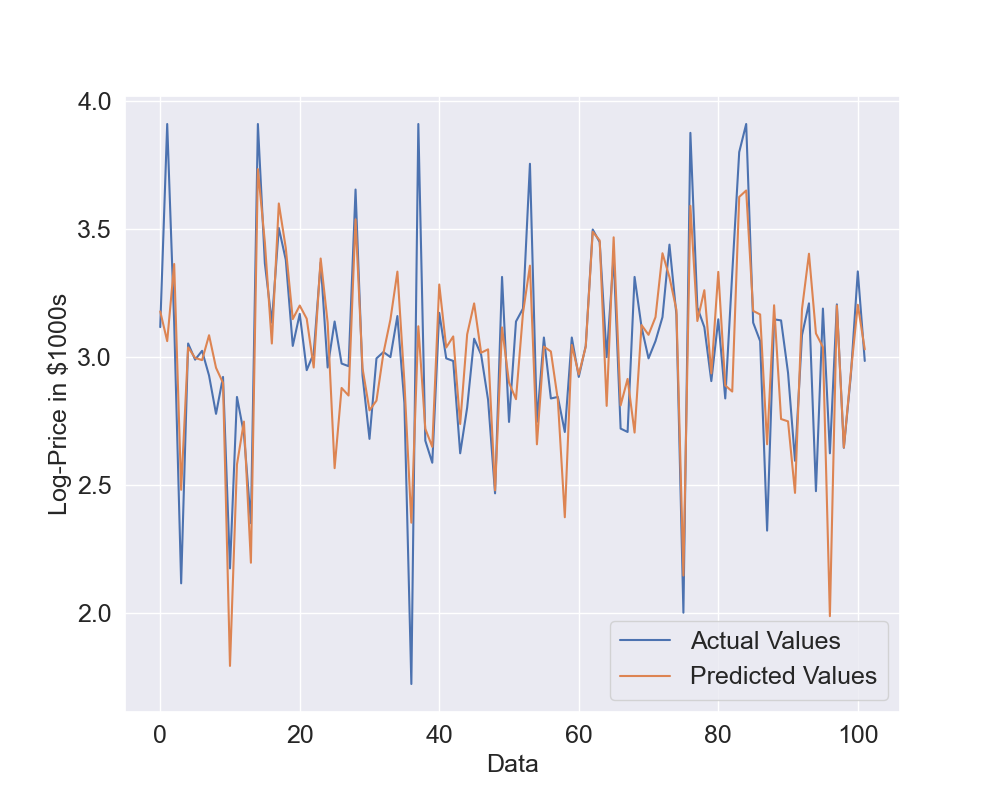
Now that we have a trained model, we want to see its performances against the training and testing data and also see some plots of the actual and predicted values. We are going to create a function called linear_predictions to do that. Line 1 shows that the input of the functions are the trained model reg, the independent data x, the target y and the label text for the plots. Line 2 prints on the console the R2 which is a common metric used to evaluate linear models and the values of this metric are typically between 0 and 1 although it can become negative. Line 3 uses the metrics library to calculate the Root Mean Squared Error (RMSE) which is another common way of evaluating models in regression problems. Line 4 uses numpy library to round the values to only 2 decimals and then it is printed on the console with Line 5. Lines 6 to 13 are used to create the plot using matplotlib with both the actual values and the predicted values. In particular, the actual values are plotted using line 7 and the predicted values are plotted using Line 8. Then, Line 16 uses this newly created function with the training data while Line 18 uses this function with the testing data.
def linear_predictions(reg,x,y,text):
    print("R2: "+str(reg.score(x, y)))
    rmse=metrics.mean_squared_error(y,reg.predict(x),squared=False)
    rmse=np.round(rmse,2)
    print("RMSE: "+str(rmse))
    plt.figure(figsize=(10, 8))
    plt.plot(y,label="Actual Values")
    plt.plot(reg.predict(x),label="Predicted Values")
    plt.legend(fontsize=18)
    plt.tick_params(labelsize=18)
    plt.xlabel("Data",fontsize=18)
    plt.ylabel(text,fontsize=18)
    plt.show()

print("Training Data")
linear_predictions(reg,x_train,y_train,"Price in $1000s")
print("Testing Data")
linear_predictions(reg,x_test,y_test,"Price in $1000s")
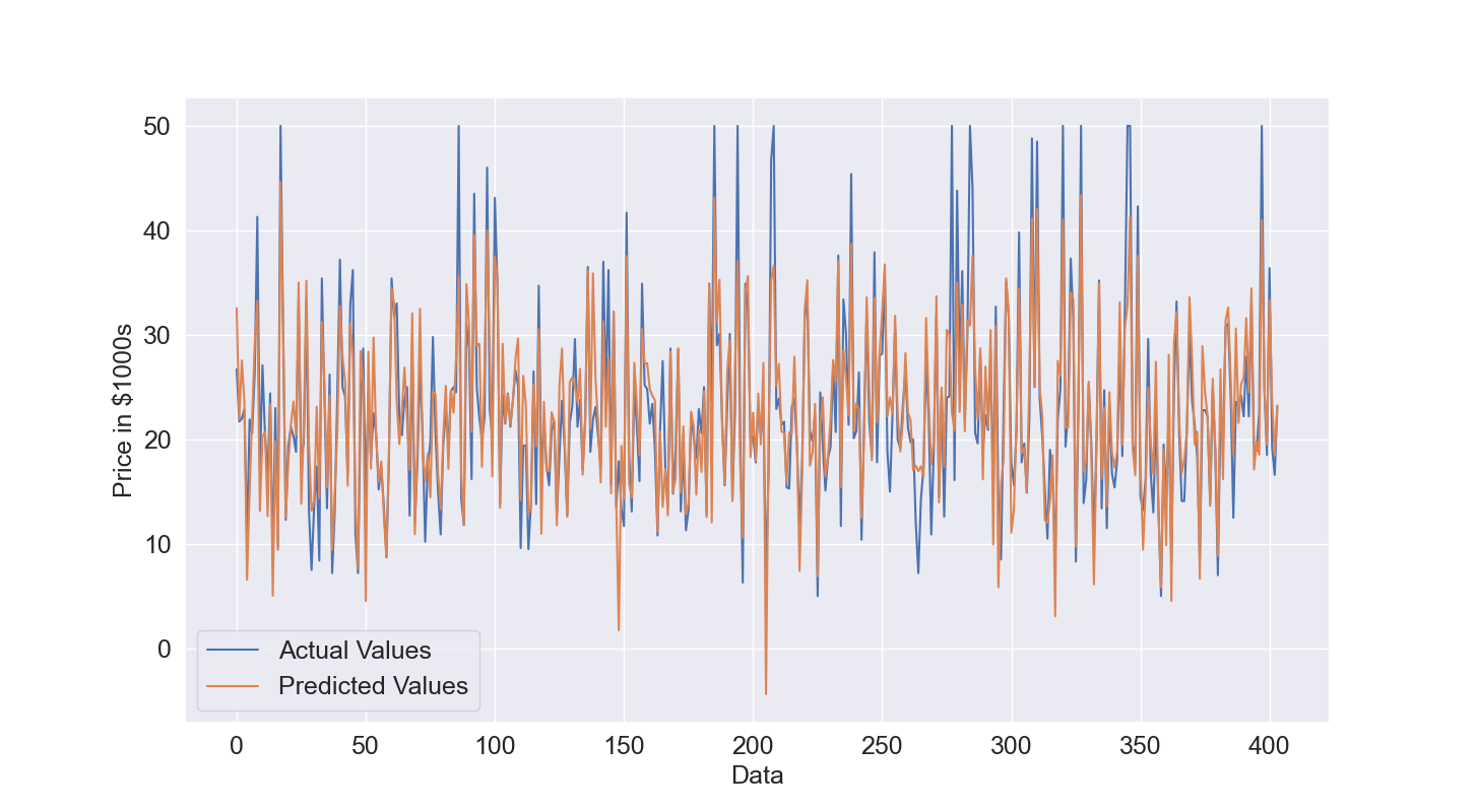
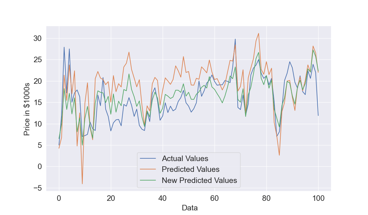
Let's see the results obtained. We start with the training data. In Figure 2, given the amount of data, it is difficult to understand how good is the prediction but overall the predicted values in orange have a pattern similar to the actual values. This is confirmed by the quantitative results, the R2 is 0.77 which is quite good and the Root Mean Squared Error is 4.4.
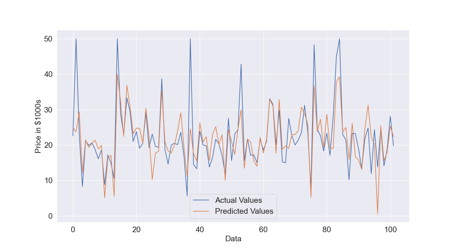
We will check the Root Mean Squared Error of the testing data to understand if the model performance are still good with unseen data. The plot of comparison between actual and predicted values for the testing data (Figure 3) shows that the Linear Model is overall able to get acceptable estimates. The R2 is around 0.6 which means that the model is able to explain 60% of the output variations and also RMSE raises from 4.4 to 5.78 which is expected but the increase is not really excessive.
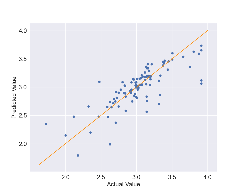
We can also create a scatter plot of the actual vs predicted values: in case of perfect results all the dots will be on the identity line which is the line at 45 degrees where y=x. Let's create a function in Line 1 called scatter_plot which accepts the trained model, the inputs and the outputs. I called the variables x_test and y_test because I will use it only on the testing data. Lines 2 to 10 use matplotlib functions to create the scatter plot and set the dimensions, labels and so on. In particular, Line 3 is where the scatter plot is effectively created by including the actual values y_test and the predicted values using the trained model and the input x_test, Lines 7 to 9 create the identity line by starting it slightly before the smallest y value and ending it slightly after the highest y value. This function is called in line 11 using the testing data and the trained model.
def scatter_plot(reg,x_test,y_test):
    plt.figure(figsize=(10, 8))
    plt.scatter(y_test,reg.predict(x_test))
    plt.tick_params(labelsize=18)
    plt.xlabel("Actual Value",fontsize=18)
    plt.ylabel("Predicted Value",fontsize=18)
    plt.plot([min(y_test)-0.1,max(y_test)+0.1],
             [min(y_test)-0.1,max(y_test)+0.1],
             color="darkorange")
    plt.show()
scatter_plot(reg,x_test,y_test)
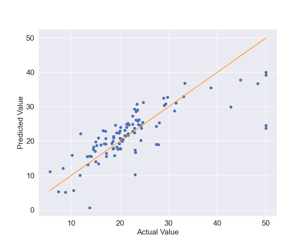
The results, in Figure 4, show that several points are close to the orange identity line however there are some outliers. This is especially true for the points where the actual values are above 40.
Another way of assessing the performance of the model is by using cross-validations. Essentially we split the data into n parts called folds, in this case 5, and the we will use 4 parts for training and 1 for testing. We will then repeat it by swaping the one used for testing with another used for training and this is repeated until all the folds have been used for testing which in this case means that it will be repeated 5 times. Let's create the function: in line 1 you can see that the inputs of the function are the trained model, the full input and output data, given that the methodology will automatically split them into training and testing data, and then the number of folds. Line 2 shows that we will use the cross_val_score function with all these data and then we simply print the results of the function which is a vector with the performance scores for all the tested folds which in this case they are calculated by using R2.The results obtained are: Scores [ 0.639 0.714 0.587 0.079 -0.253 ], Mean Scores 0.35 and Std Scores 0.38. We can see that the overall mean of R2 is quite low and the standard deviation is high. This happened because in the last 2 cases the R2 is close to 0 or even negative which means that the results are not good.
def cross_validation(reg,x,y,nfold):
    scores = cross_val_score(reg, x, y, cv=nfold)
    print("Scores: "+str(scores))
    print("Mean Scores: "+str(np.mean(scores)))
    print("Std Scores: "+str(np.std(scores)))
cross_validation(reg,x,y,5)
If we plot the output (Figure 5) we can see that towards the end of the data, after 400 datapoints, the output is quite different so the 80% of the data used to train the model are not representative of all possible scenarios. So the model is unable to predict properly the remaining 100 datapoints. This did not happen before when we split the data into training and testing data because in that case 80% of the points were randomly sampled from the full dataset and not the first 80% of the points.
In the Section below we will try to further improve the current model.
Use of Log-Prices
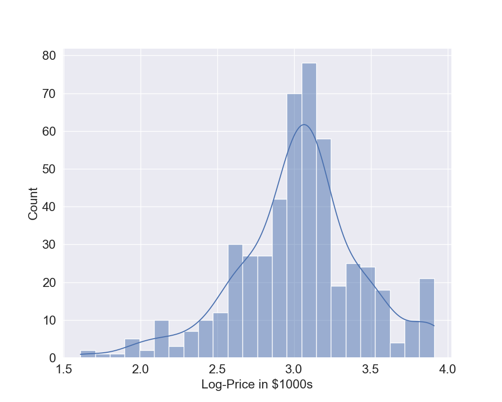
As shown at the beginning of the previous section, the histogram of the output is slightly skewed so we can also try to use the Log transformation of the output to see if we can get better results. To do this, we use again all the previously defined functions and now the code to perform the training of the model, to produce all the plots and performance results is quite compact. What changes is, in Line 1, the output which now is the log-transformed output. You can see from the histogram that now there seem to be fewer outliers (Figure 6) and it seems to be less skewed.
y=np.log(y)
plot_histogram(y,"Log-Price in $1000s")
x_train, x_test, y_train, y_test = train_test_split(
    x, y, test_size=0.2, random_state=0)

reg = LinearRegression().fit(x_train, y_train)
print("Training Data")
linear_predictions(reg,x_train,y_train,"Log-Price in $1000s")
print("Testing Data")
linear_predictions(reg,x_test,y_test,"Log-Price in $1000s")

scatter_plot(reg,x_test,y_test)
cross_validation(reg,x,y,5)
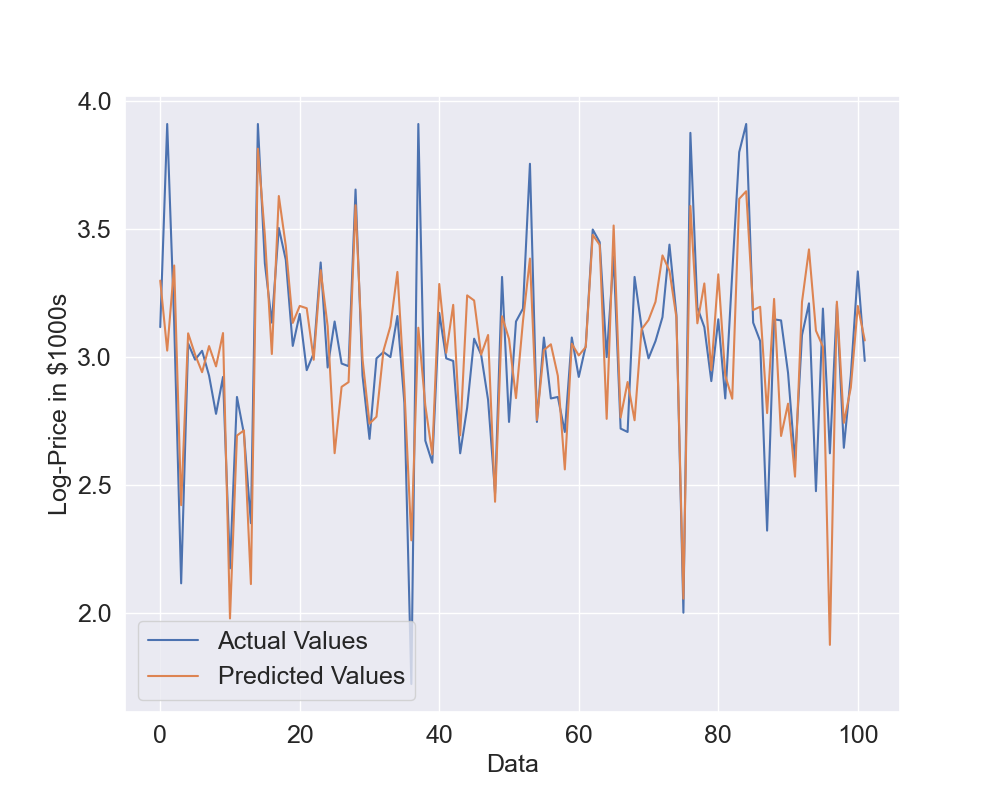
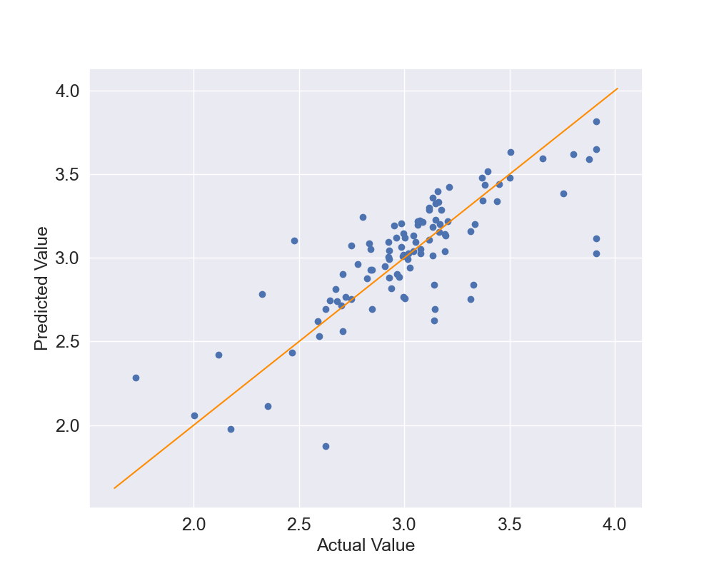
Let's see what results we can obtain in this case: Figure 7 shows the actual vs predicted values while Figure 8 shows the scatter plot. Now the predicted values are again quite close the the actual values but they seem to be able to better predict the log-prices. Also, the dots in the scatter plot seem to be closer to the identity line but we will use quantitative metrics to confirm this.
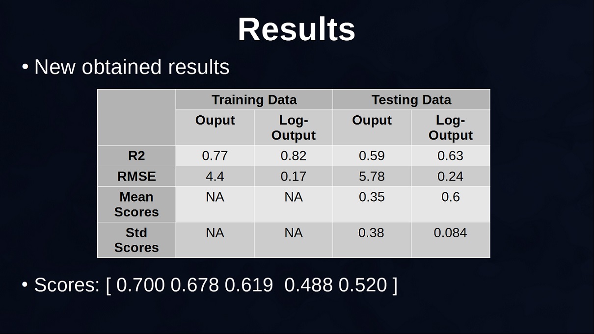
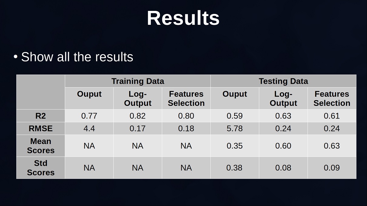
The table below (Figure 9) shows the results obtained using the original output and the ones obtained with the log transformed output. Remember that the results are not directly comparable given that in the case of log-output the output has a smaller range and this also decreases the root mean squared error, also the new R2 explains the percentage of variation of the log-transformed output and not the original output. Overall, you can see that the linear regression seems better at predicting the log-prices and also more consistent given that the standard deviation of the scores is quite small.
If we convert the predictions of the log-prices to the original prices by using the exponential function and plot the last 100 datapoints where the model with the original output was obtaining a negative R2, we can see that the Predicted Values previously found in orange are quite overestimated because the last 100 points typically have smaller values. On the other hand, with the new predictions this is less problematic. So, we decide to keep using this model and do a further step in the section below.
Features Selection and Final Analysis
We will perform features selection to remove less relevant features and, in Line 1, we use the function RFE that we imported at the beginning. The function needs the number of features, I tried several of them and it seems that 7 is a good value. The step is set to 1 which means the methodology attemps to remove features one by one. In Line 2 the RFE function fits the training data to select 7 features and assign rank 1 to these features. Lines 3 and 4 create new training and testing inputs by only selecting the columns with rank 1. Another way of doing this is to use the function "transform" provided by RFE. Now we have only 7 columns instead of 13, half the amount of features. The other lines repeat again the same operations to fit the data, creat plots and provide results.
selector = RFE(LinearRegression(), n_features_to_select=7, step=1)
selector = selector.fit(x_train, y_train)
x_train=x_train[:,np.where(selector.ranking_==1)[0]]
x_test=x_test[:,np.where(selector.ranking_==1)[0]]

reg = LinearRegression().fit(x_train, y_train)
print("Training Data")
linear_predictions(reg,x_train,y_train,"Log-Price in $1000s")
print("Testing Data")
linear_predictions(reg,x_test,y_test,"Log-Price in $1000s")

scatter_plot(reg,x_test,y_test)
cross_validation(reg,x[:,np.where(selector.ranking_==1)[0]],y,5)
Before looking at the results, we can see the 7 most relevant features that were selected:
- CRIM: per capita crime rate by town
- CHAS: Charles River dummy variable
- NOX: nitric oxides concentration (parts per 10 million)
- RM: average number of rooms per dwelling
- DIS: weighted distances to five Boston employment centres
- PTRATIO: pupil-teacher ratio by town
- LSTAT: % lower status of the population
The plots on the testing data (Figures 11 and 12) show that the predictions are close to the actual values although we are using half the number of features. The model now will be faster to fit in case there are more datapoints, however, with the current amount of data the gained time is negligible.
Overall it seems that we removed features that were not essential in the prediction of the prices but the metrics will confirm that: Figure 13 shows all the results obtained. The results between the Log-Output and the model with reduced amount of features can be compared because they use the same log-transformed output. They are overall quite similar and do not have significant differences. However, the difference in terms of number of features is significant. This does not mean that the other features are not informative, maybe a more complex model instead of a linear regression is able to take advantage of the other features to get more precise prices but in the case of a linear regression these selected 7 features provide overall good predictions.
Let's analyze the values of the coefficients of these 7 features to understand if they make sense (the values are rounded):
- CRIM: -0.01
- CHAS: 0.12
- NOX: -0.73
- RM: 0.1
- DIS: -0.04
- PTRATIO: -0.04
- LSTAT: -0.03
- The first coefficient is related to the crime rate and the coefficient is negative. This is expected because in an area with more crimes the price of the houses decrease.
- The second coefficient tells if houses are close to the Charles River. This is a dummy variable that can be 0 or 1. So if we compare 2 houses where the only difference is this dummy variable, the house close the Charles River is more expensive.
- The third coefficient is related to pollution. The coefficient is negative and this is expected because places with a lot of pollution, if all the other features are the same, are typically less attractive and prices are reduced.
- The fourth coefficient is related to the number of rooms and this is a positive coefficient because more rooms in average means more cash needed to buy the place.
- The fifth coefficient is a weighted distance from employnment centres and this is negative given that houses more distant from these places means longer commute and they tend to cost less.
- The sixth coefficient is the ratio between pupils and teachers, you want this as small as possible because that means that there are many teachers. On the other hand, when the value increases means that each teacher needs to teach more students and this might lead to large classes which is typically considered not ideal. In this case the ratio is correctly negative because when the ptratio increases the price of the houses decrease.
- The last coefficient is related to the percentage of the population with lower status which seems to be related to the education and the type of jobs in the area. Also this coefficient is negative given that in elite neighborhoods this number is small and this leads to an increase in price of the houses.
Overall, we can see that all the features selected are very relevant for the selection of a house, they take into account topics like safety, available space, pollution, distance from work, education. These are all important factors to consider when people think to buy a house. Also, the sign of the coefficients are in line with expectations, so the selected linear model seems a good choice.
Comment on Reddit
Related Topics
Latest AI and ML Pages
- [1] Python code of common Regression Metrics from scratch and also by using sklearn
- [2] Interactive Polynomial Regression Code modifiable by the user in Javascript
- [3] Polynomial Regression is used to predict Coronavirus cases with scikit-learn
- [4] An example problem which uses Polynomial Regression: The Rescue Mission
- [5] Code of Polynomial Regression created from scratch in Python using only main equations
Top AI and ML Pages
- [1] Introduction to Artificial Intelligence and Machine Learning
- [2] Details and formulas of some common Regression Metrics: MAE, RMSE, MSE, R2
- [3] Introduction to Linear Regression, main equations and concepts
- [4] Introduction to Polynomial Regression, main equations and concepts
- [5] Linear Regression is used to predict the house prices with scikit-learn